There’s only Oneindia
Oneindia chose holistic journalism over viral outrage, recognising multiple perspectives within one unified India. This philosophy required a brand voice embracing contradictions whilst finding common ground, speaking to all Indians without patronising any segment.
The category problem
Designed for viral engagement, the Indian news media operate on conflict economics, where stories become India versus India. Traditional platforms amplify division through urgent reds and confrontational blues that demand attention. Audiences grow exhausted by information that polarises rather than educates, creating echo chambers.
The identity solution
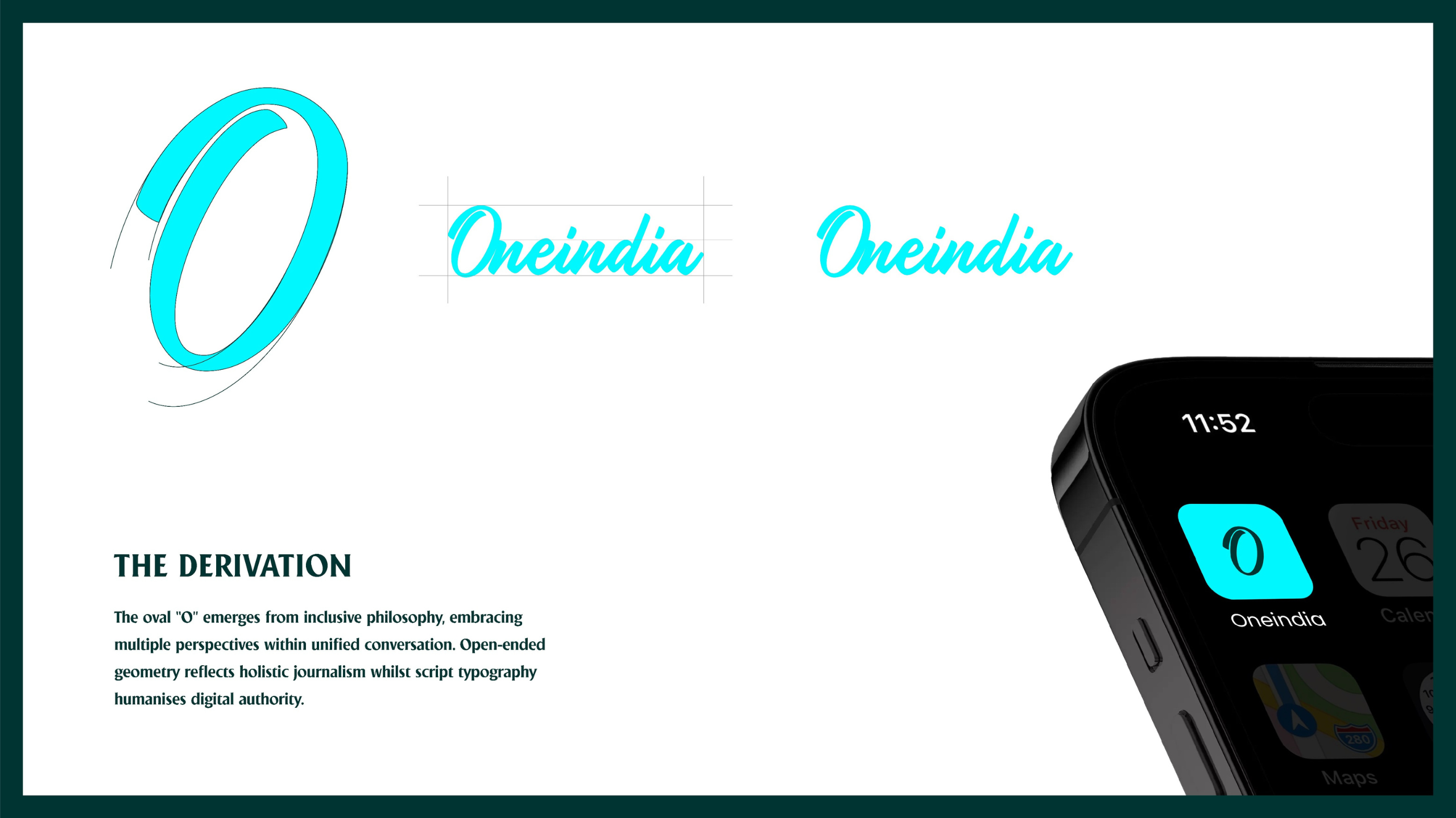
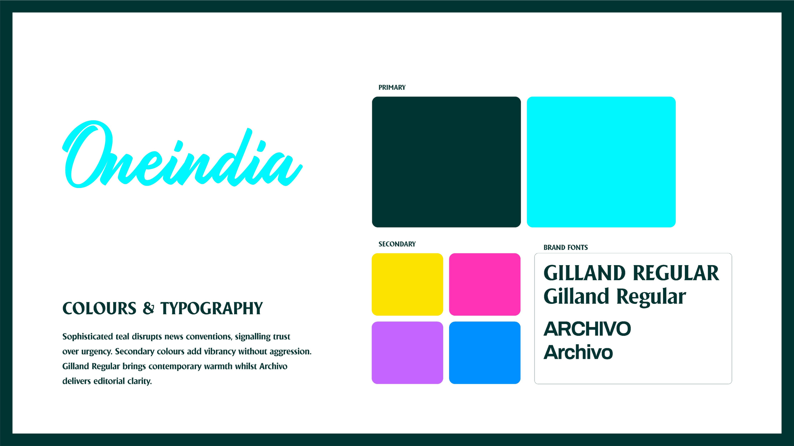
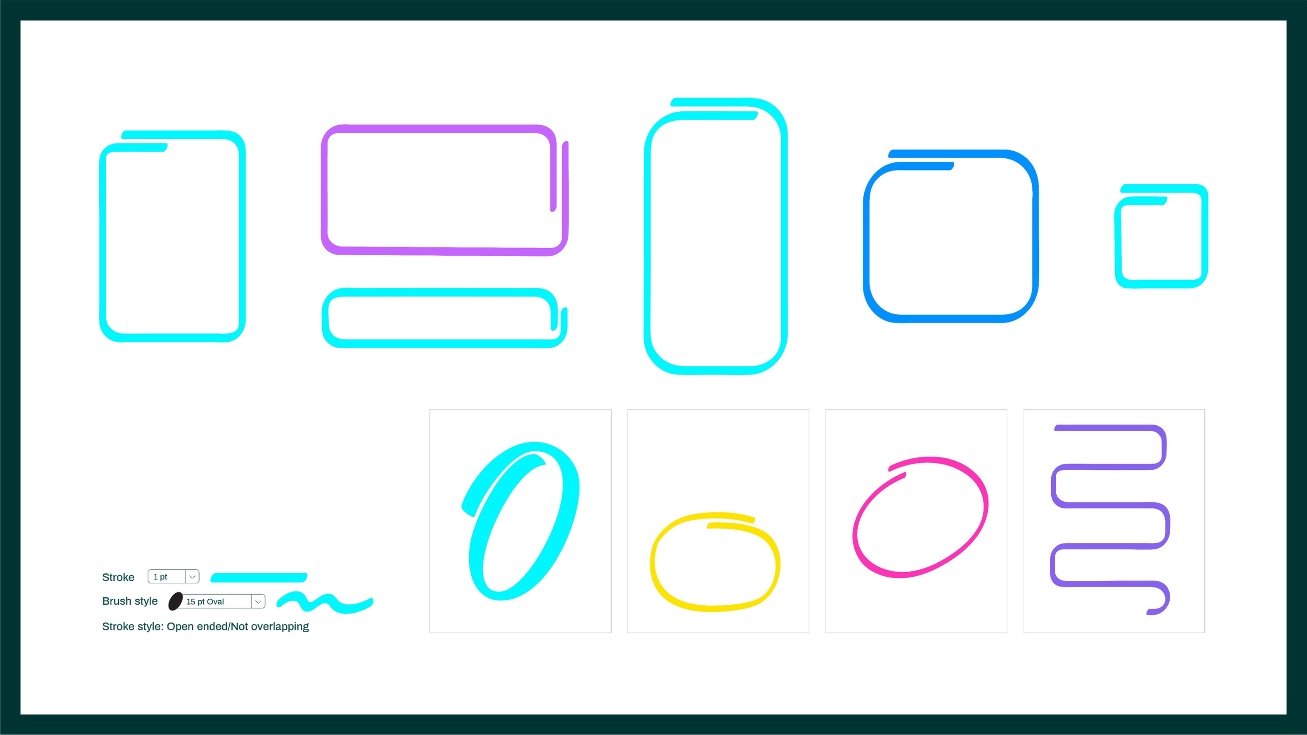
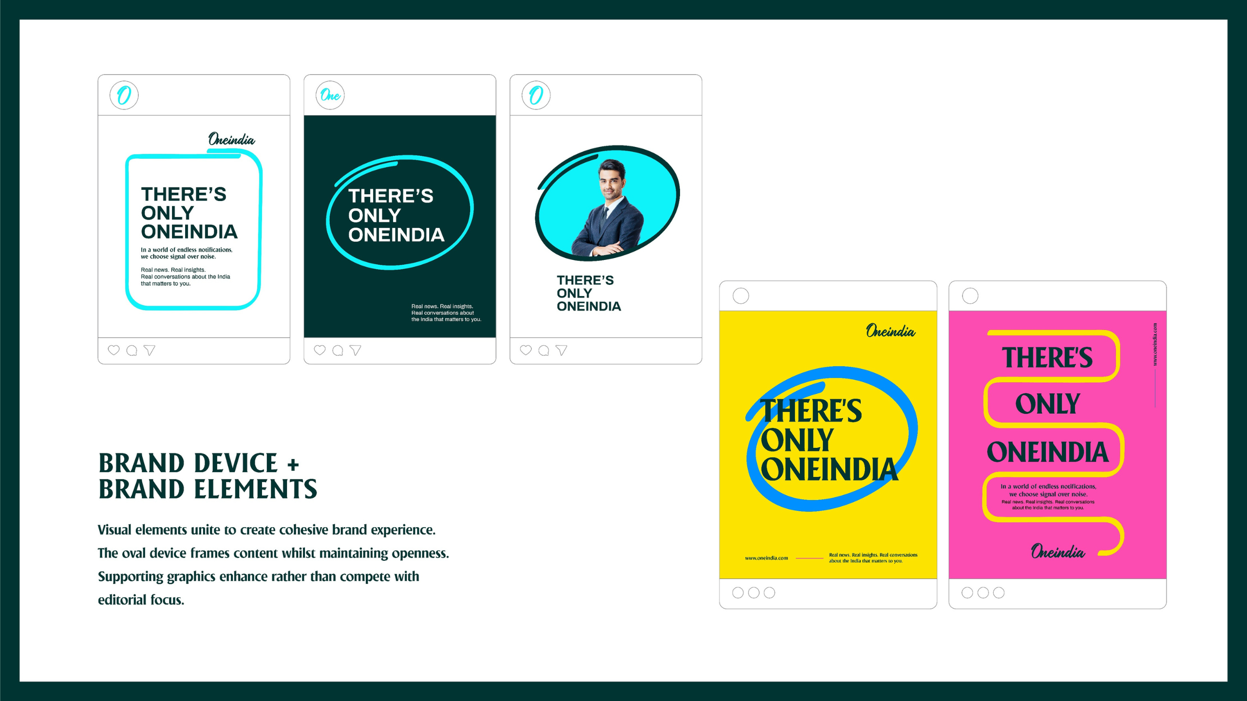
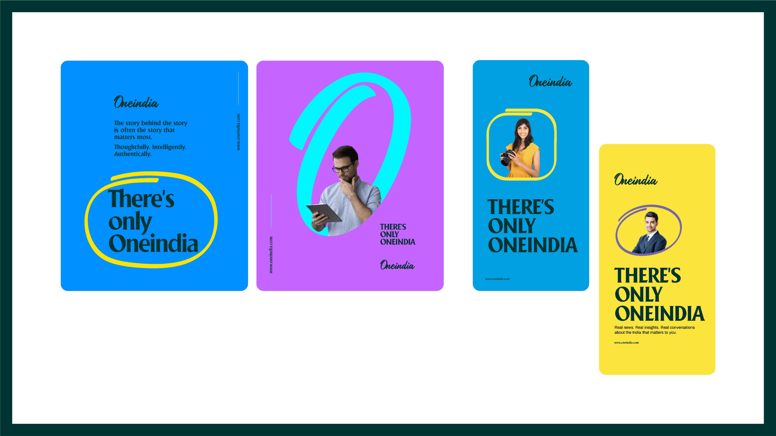
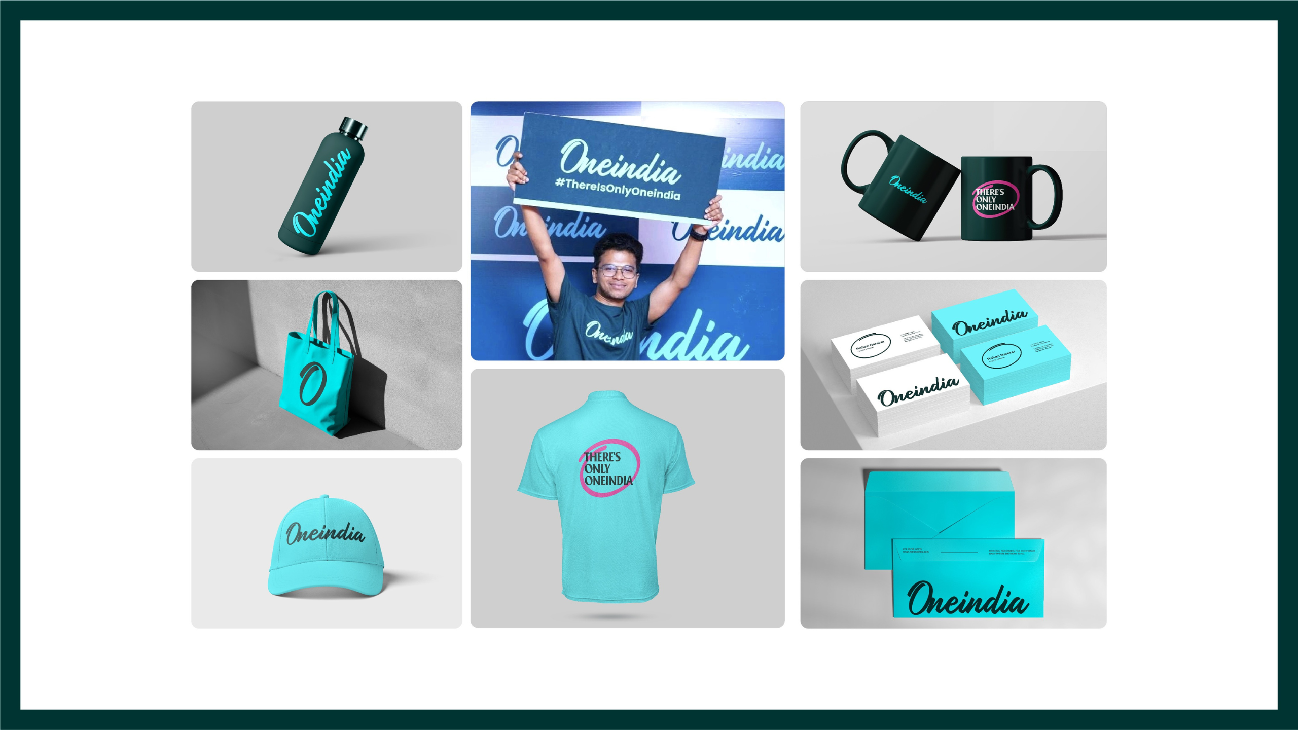
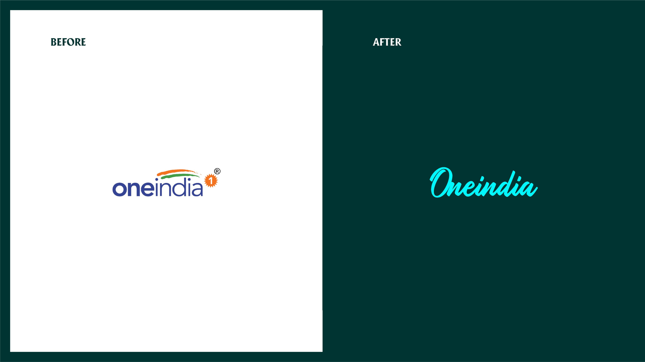
We designed an identity anchored by the masthead, the singular word ‘Oneindia’. The oval ‘O’ represents openness, bringing perspectives into unified conversation. Sophisticated teal replaces confrontational colours with trust signals. Gilland Regular paired with Archivo creates approachable authority.
The positioning
Oneindia takes complete pictures whilst competitors take sides. The positioning prioritises thoughtfulness over volume, unity over division, conversation over confrontation. Quiet confidence rather than aggressive competition defines the approach.